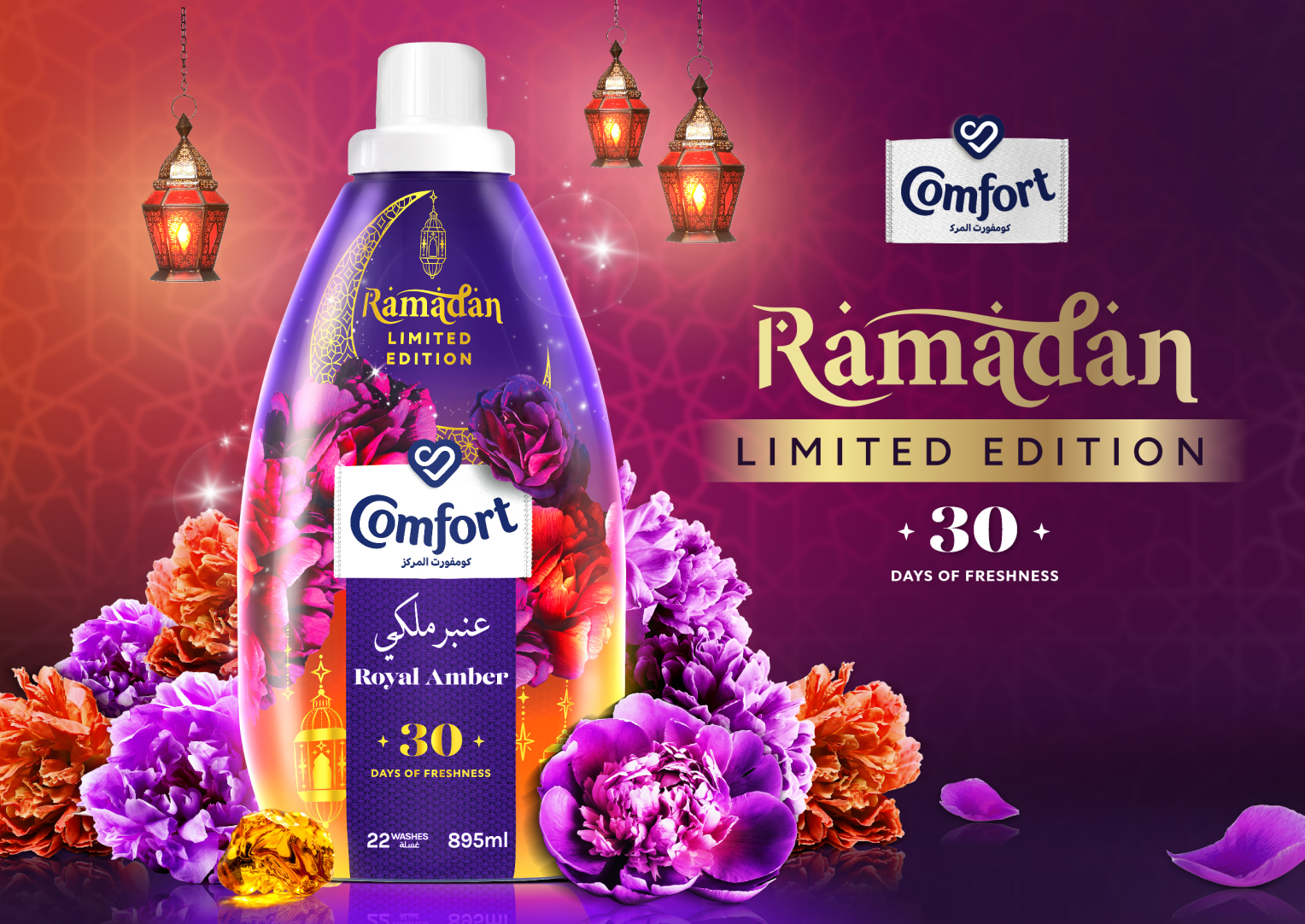
Comfort Ramadan Limited Edition
Turning a seasonal product launch into a vibrant Ramadan brand experience.
Overview
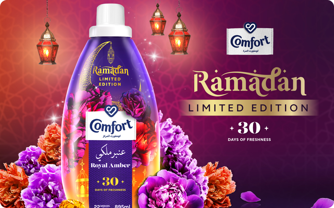
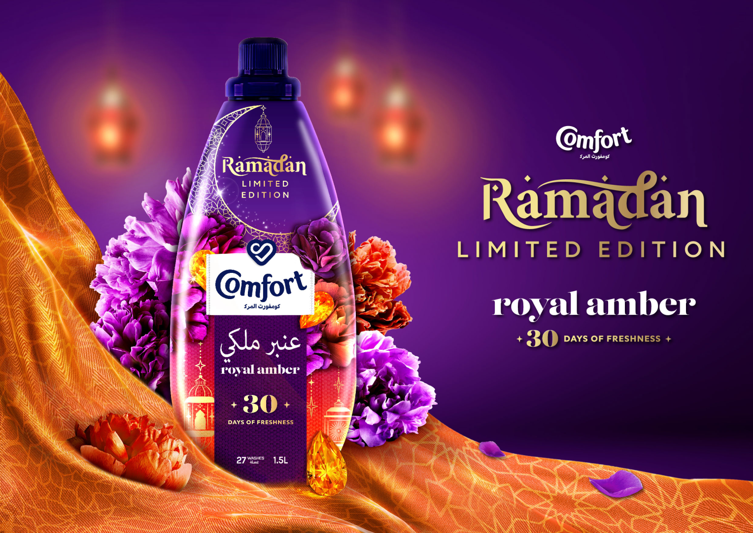
Comfort Ramadan Limited Edition was a creative key visual project developed to launch the new Comfort Royal Amber Ramadan Limited Edition pack across the MENA region. The goal was to create a visual identity that felt festive, premium and culturally relevant, while still staying unmistakably within the Comfort brand world.
The work needed to do more than just showcasing the product. It had to communicate three key messages at a glance: New Royal Amber, Ramadan Limited Edition, and 30 Days of Freshness.
The Brief
The brief was to capture the spirit of Ramadan through a visually compelling Key Visual, using the existing pack as the hero while building a world around it that felt warm, celebratory and premium.
The brand guidelines called for lush flowers, bright colours, strong product and logo visibility, and a distinctive visual language. At the same time, the creative needed to bring in subtle Islamic influences and the atmosphere of Ramadan, particularly the feeling of celebration around the break of dawn. This created an interesting challenge: how could I make the visual feel distinctly Ramadan without allowing the festive elements to overpower the product or brand?
The Creative Solution
I explored three creative territories, each approaching the brief from a different perspective.
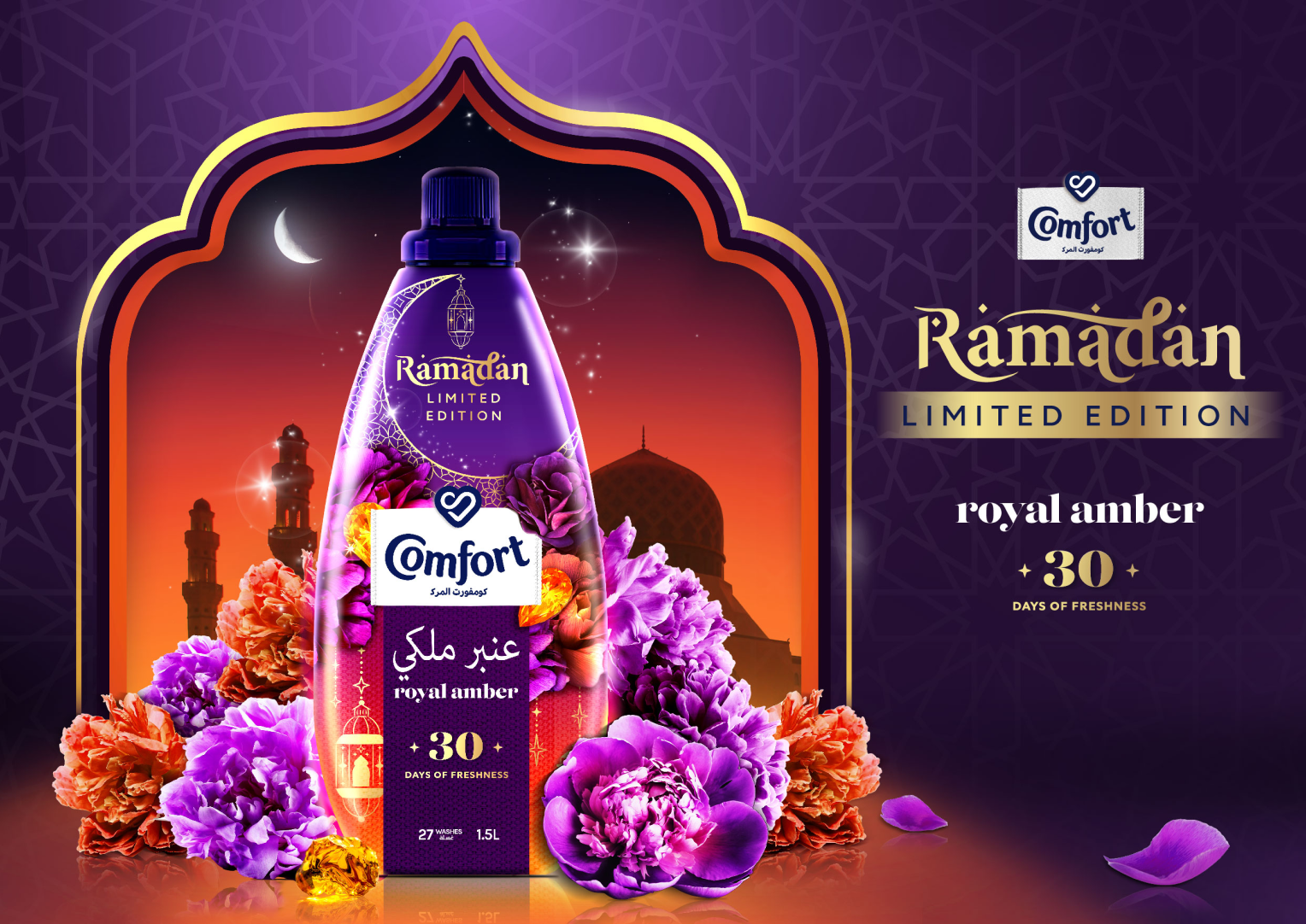
01: Twilight Festivities
A more atmospheric, storytelling-led direction that places the product within a Ramadan skyline at twilight. The moon, lanterns, architectural details and warm horizon create a sense of the celebration beginning, while the flowers and pack keep the focus firmly on Comfort.
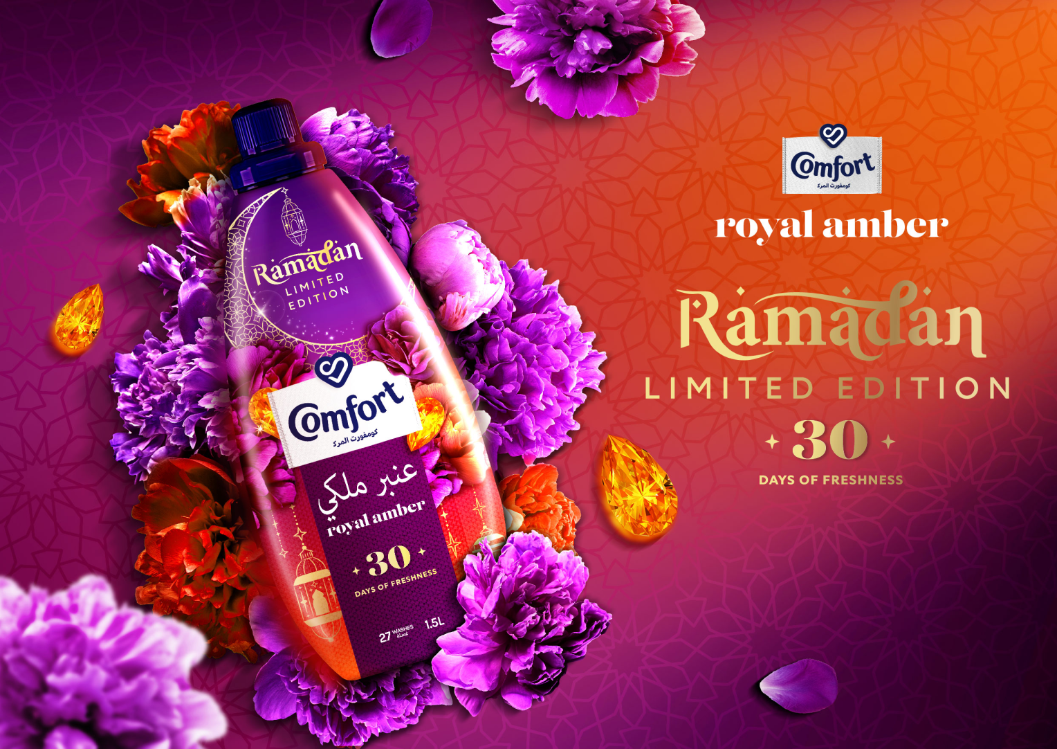
02: Immersive
A more dramatic and contemporary approach, using flowers almost as an extension of the product itself. The surrounding blooms create a sense of abundance and freshness, while the angled pack and contrasting purple/orange palette give the visual energy and depth.
03: Fresh Fabric
A softer, more luxurious direction inspired by flowing fabric and traditional textile patterns. This approach connects the idea of freshness and softness directly to the product benefit, while creating a premium Ramadan atmosphere through colour, texture and lighting.
How the Brief Shaped the Creative Focus
What made this project particularly valuable was the balance between brand consistency and creative exploration.
Instead of treating the Ramadan elements as decoration, I used the brief to identify what the visual needed to communicate emotionally: freshness, celebration, warmth and a sense of occasion. That thinking influenced everything from the colour palette and lighting to the choice of flowers, Islamic-inspired patterns, composition and product placement.
The pack remained the anchor throughout. Every creative decision was made with the hierarchy in mind, with Comfort first, Royal Amber and Ramadan Limited Edition next and the 30 Days of Freshness benefit clearly communicated. This helped turn what could have been a standard seasonal product visual into a more considered brand experience.
The Outcome
The final directions demonstrate how one brief can be translated into multiple visual stories while maintaining a consistent brand identity.
For me, the strongest part of the project was the ability to move between strategy, art direction and visual execution by taking a relatively straightforward product launch brief and finding different creative ways to make the product feel desirable, culturally relevant and memorable. It also strengthened my approach to designing campaign work: start with the communication hierarchy, understand the emotional role of the product, and then build the visual world around it.
That combination of creative thinking, cultural sensitivity and commercial awareness is what I would bring to future brand and campaign projects.