Everfresh: An IOT Smart Fridge System
Designing a Smarter way to manage food at home.
Overview
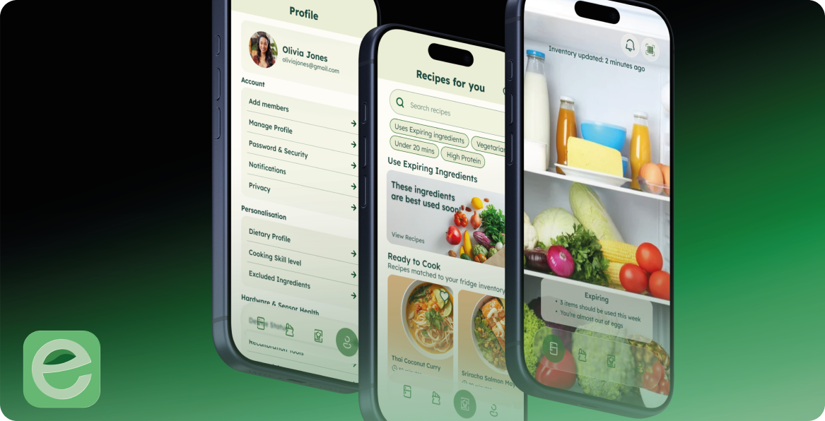
Everfresh is an IoT-driven smart fridge ecosystem designed to break the “buy and forget” cycle that leads households to waste food, money, and time. Instead of requiring people to replace their refrigerator with an expensive smart appliance, Everfresh brings intelligence to the fridge they already own through a combination of clip-on sensors, a wide-angle camera, smart weight mat, linked to a mobile app.
The experience automatically builds awareness of what is in the fridge, identifies food that needs attention, and turns that information into useful actions, from expiry alerts to personalised recipe suggestions.
I approached the project end-to-end, moving from market and competitor research through product strategy, user research, information architecture, wireframing, design system, and final UI design. I also used AI-assisted tools, primarily Gemini, throughout the process to accelerate research synthesis, explore possibilities, challenge assumptions, and validate ideas. The goal wasn’t to outsource design thinking, but to create a faster feedback loop between research, hypothesis, and design decision-making.
This created an opportunity
Could we bring the intelligence of a smart fridge to any refrigerator, without asking people to change their behaviour?
The product needed to help users:
- Know what food they have without manually logging everything
- See what needs attention at a glance
- Receive useful, contextual expiry reminders
- Reduce food waste and save money
- Decide what to cook using ingredients that need to be used first
The design challenge became less about tracking food and more about removing the work involved in tracking it.
01: Research First
How might we make smart-fridge intelligence accessible without making people buy a smart fridge?
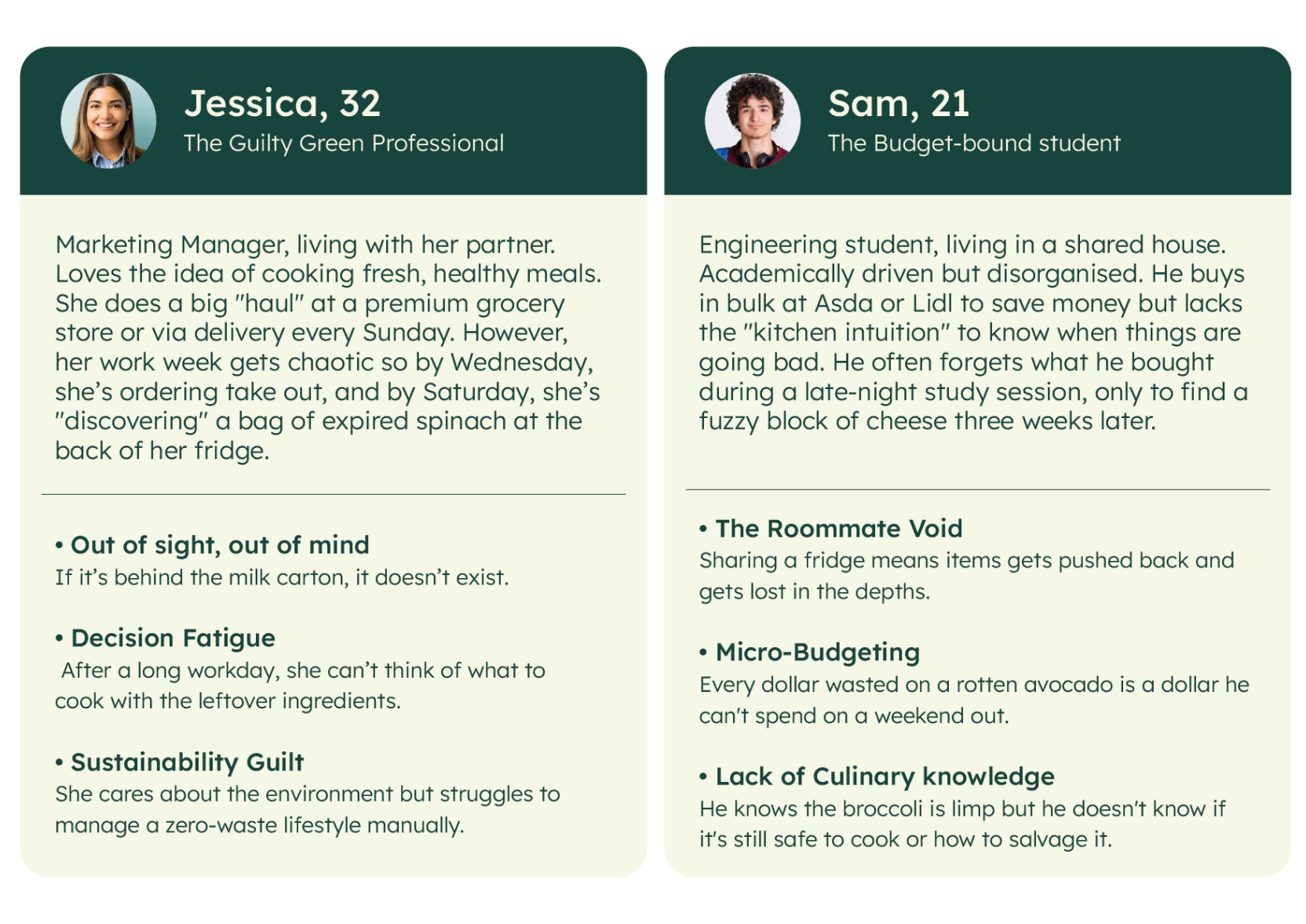
Existing smart-fridge experiences tend to fall into two extremes: Expensive hardware that locks intelligent inventory management into premium appliances, or high-friction apps that expect people to manually scan, log, and maintain their food inventory.
Before designing the interface, I wanted to understand where the category was succeeding, where it was failing, and what users actually needed from it. I used a combination of competitor analysis, user research, AI-assisted research synthesis, and iterative hypothesis testing to move from a broad idea, “a smarter fridge”, towards a more focused product proposition.
02: Competitive Analysis: Finding the White Space
I mapped Samsung SmartThings, Bosch Home Connect, and GE SmartHQ across hardware, software, cloud infrastructure, and UX. Rather than simply comparing features, I looked for the structural gaps between what these products offered and what a broader audience actually needed.
01 Retrofit gap
Smart inventory shouldn’t require a new appliance. Everfresh uses affordable add-on hardware, making the concept relevant to people with existing refrigerators, including renters and students.
02 Friction to entry gap
Inventory management shouldn’t become another chore. Instead of relying on manual logging, Everfresh combines receipt scanning, camera recognition, and weight sensing to automate the process.
03 Awareness gap
Information should lead to an outcome. Competitors can tell users what’s in their fridge. Everfresh goes a step further by turning expiry information into personalised recipe suggestions.
04 Privacy Gap
A smart fridge shouldn’t feel like surveillance. The concept uses local-first intelligence, with image processing happening on-device rather than requiring fridge imagery to be sent to the cloud.
The Resulting Proposition
Everfresh doesn’t compete by making the smartest refrigerator. It competes by making any refrigerator smarter, with less friction and more useful intelligence.
03: From Research to Product Architecture
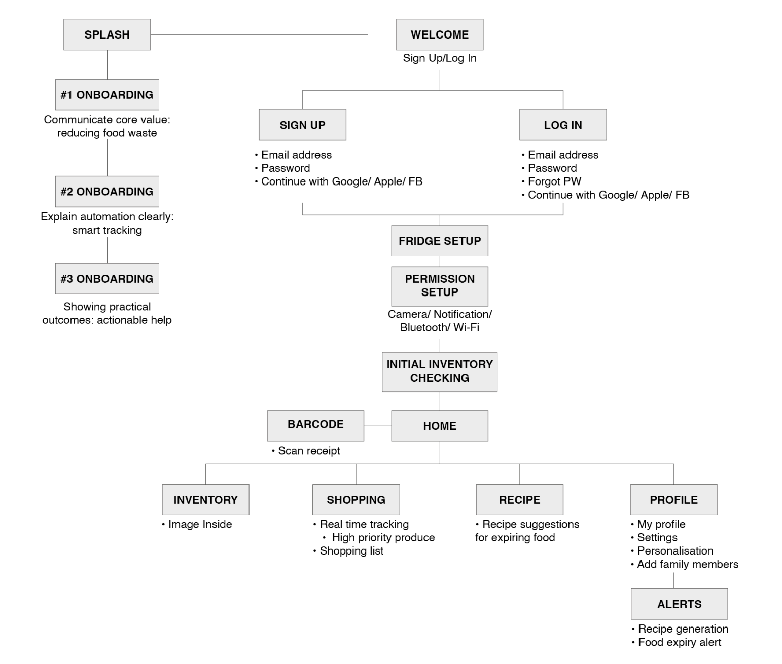
Once the product opportunity was clear, I translated the research into an information architecture centred around awareness → action → habit.
The product wasn’t designed around the hardware itself. It was designed around what users actually want to accomplish:
Know what I have → Know what needs attention → Decide what to do → Keep my kitchen running
This shaped the core navigation and experience around:
Inventory · Shopping · Recipes · Profile
The architecture keeps the most important information close to the surface while allowing more complex functions like hardware health, personalisation, and household management to sit deeper in the experience.
04: Wireframing: Testing the Experience Before Styling It
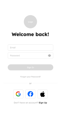
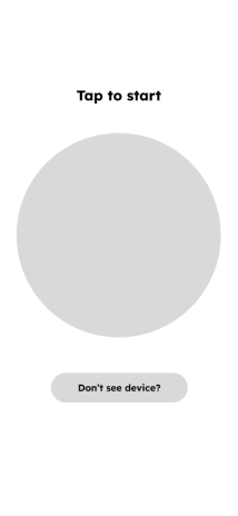
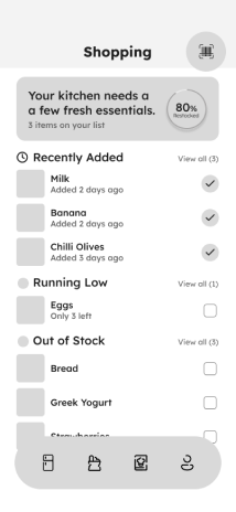
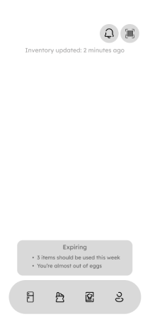
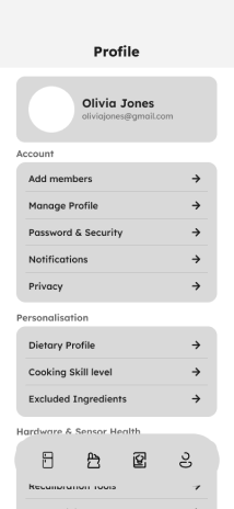
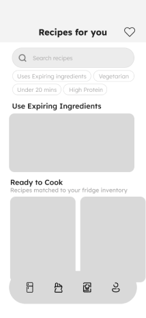
Users need a quick visual understanding of what’s fresh, what’s running low, and what needs using. Knowing that something is expiring isn’t enough, the product should help users decide what to do about it. I wireframed the full flow before styling it, from onboarding and hardware setup through inventory, shopping, recipes, and profile.















05: Building the Design System
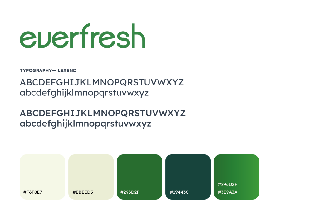
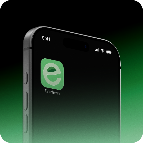
The visual language needed to communicate two seemingly opposing qualities: freshness + technology. I developed a system around deep forest greens and soft sage tones, creating an organic, food-oriented foundation while allowing the technology and AI layer to feel credible rather than clinical.
The objective was to make the technology feel quiet and approachable.
06: Final Product Experience
Onboarding — Communicating value before setup
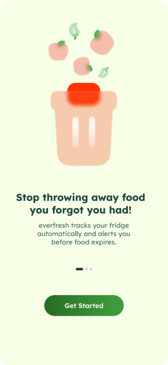
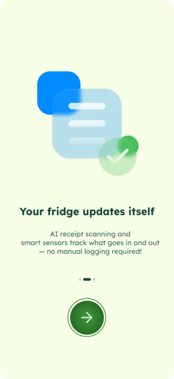
The onboarding experience establishes the product’s core value of automation and food awareness before introducing hardware. I also changed the primary CTA from a generic action to “Create my kitchen.” This creates a sense of ownership and makes the product feel personal from the first interaction. Notification permissions are introduced later, once users understand why notifications are useful, rather than asking for permission immediately on launch.

Setup — Making IoT feel approachable
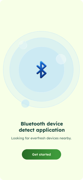
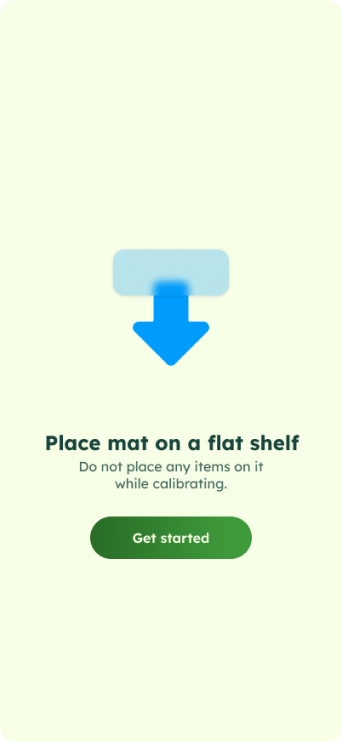
Hardware setup can be one of the biggest friction points in connected-home products. I designed a guided setup experience around:
QR pairing → Bluetooth connection → Sensor calibration
The Bluetooth-first approach supports a more reliable local setup, while guided smart-mat calibration helps establish confidence in the accuracy of the system.

Inventory — Turning data into awareness
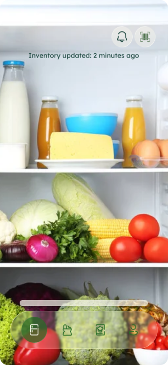
The interface is designed to answer one question immediately:
What needs my attention right now?
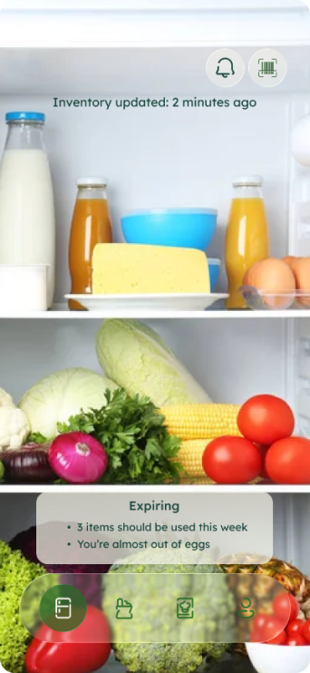
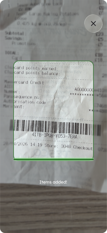
The home screen is built around kitchen awareness rather than scanning. Instead of making users interact with the system to discover what’s happening, the interface surfaces the information that matters immediately. Expiring products are highlighted directly against the fridge imagery, creating a visual connection between the product and its physical location. Quick actions such as receipt scanning and notifications are accessible without taking over the experience.
Shopping — Turning a chore into progress
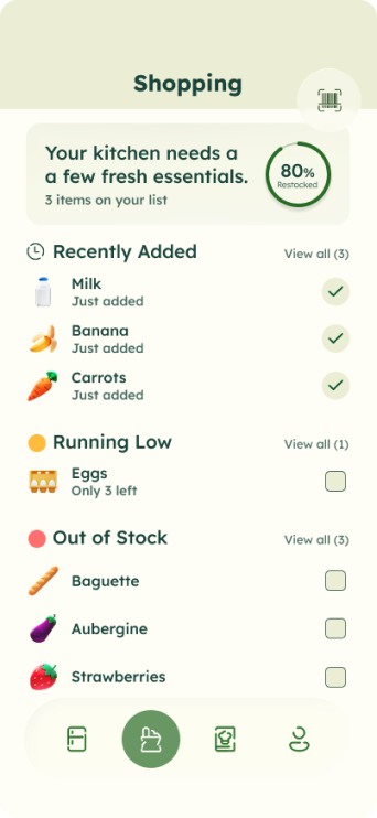
The shopping experience reframes inventory management as progress rather than maintenance. An 80% restocked indicator gives users a sense of completion, while three clear states: Recently Added, Running Low, and Out of Stock this provides reassurance that the system is actively tracking the household. This was a deliberate attempt to make a traditionally functional feature feel more motivating.
Recipes — Turning AI into an outcome
The recipe experience is where the product proposition comes together.
Gemini Nano is used to generate recipes from ingredients approaching expiry, directly addressing the decision fatigue that often contributes to food waste. The primary CTA is therefore “Use expiring ingredients” rather than a generic “Browse Recipes.” The AI isn’t positioned as a feature, it’s to solve a specific user problem. Personalisation inputs such as dietary preferences, cooking skill, and excluded ingredients further improve the relevance of recommendations.
Instead of simply saying: “You have food that’s expiring.”
Everfresh asks: “What can you make with it?”
07: AI-Assisted Design Workflow
AI was integrated into the process as a design accelerator and thinking partner, rather than a replacement for design judgment. I primarily used Gemini to:
- Accelerate competitor and market research
- Structure and synthesise research findings
- Explore alternative product hypotheses
- Challenge assumptions and identify blind spots
- Generate and compare potential UX approaches
- Validate ideas against the original user needs
- Speed up iteration between research and design
The important part of the workflow was the human validation loop:
Research → AI-assisted synthesis → hypothesis → design → critique → validation → refinement
This allowed me to spend less time on research tasks and more time on the parts where a product designer adds the most value: making decisions, identifying trade-offs, understanding context, and shaping the experience.
08: Impact
The biggest impact of the project was turning an interesting technology concept into a coherent product proposition. The initial opportunity could easily have become another “smart fridge” experience focused on sensors, AI, and connected hardware. But instead, the research and design process reframed the product around a much more human outcome:
Less tracking. Less waste. Less decision fatigue.
The result is a concept that demonstrates how I approach end-to-end product design, from identifying the opportunity to defining the experience and designing the final interface.
More importantly, it shows how I use emerging AI tools pragmatically: to move faster, challenge my thinking, and validate ideas, while keeping design judgment, user needs, and product strategy at the centre.