Huggies Magic Comfort
Turning Comfort Into a Brand Experience.
Overview
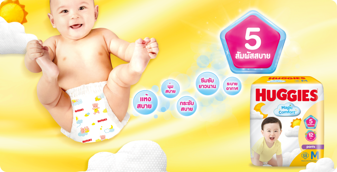
Huggies Magic Comfort was a new premium diaper proposition for parents to immediately understand the two key product benefits: The 5 Touches of Comfort and 12 hour day-and-night absorbency.
Working with my Design Director at the time, I helped develop the visual identity and packaging system for the Thailand market, creating a brand experience that could work consistently across retail,
e-commerce, and motion.
The challenge was to make functional product benefits feel tangible, ownable, and easy for parents to understand, all while still giving the premium, reassuring quality expected from Huggies.
The Brief
Create a visual identity that makes Huggies Magic Comfort’s key USPs instantly understandable by communicating the “5 Touches of Comfort” and day-and-night protection in a way that feels premium, warm, and reassuring.
Solution:
Comfort as a feling
We built a flexible visual system around the idea of comfort as a feeling, translating product performance into visual cues that parents could understand at a glance.
Packaging Design
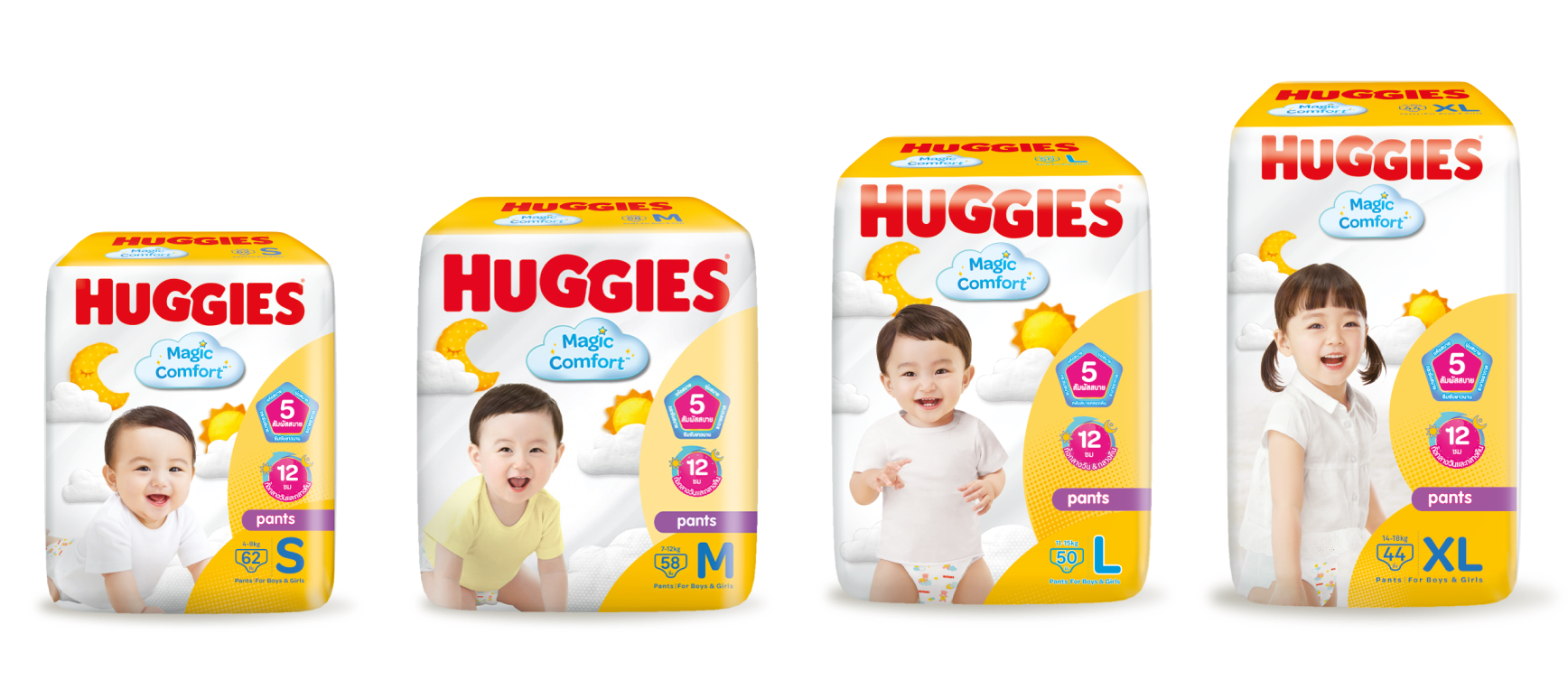
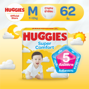
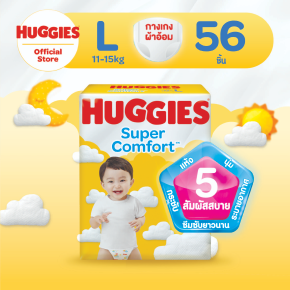
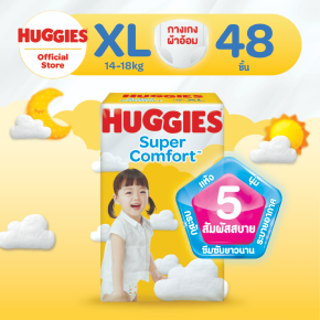
The packaging introduced a warm yellow palette and a soft, pillow-like world of clouds, sun, and moon to communicate comfort, softness, and protection. This created a distinctive shelf presence while helping establish an emotional connection with the product.
Iconography
To make the functional benefits more immediate, we developed a pentagon-shaped “5 Touches” seal as a recognisable trust signal, alongside sun and moon iconography to communicate the 12-hour day-and-night protection.


E-Commerce
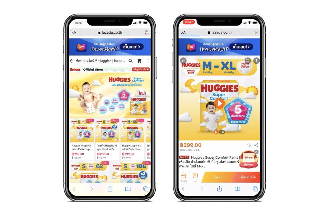
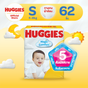
The system was then extended beyond packaging into e-commerce product carousels and animation, ensuring the same core story could translate naturally from the physical shelf to the digital shopping experience.
The Impact
The result was more than a new pack design, it was a connected visual language for the product proposition.
By turning technical product benefits into simple visual assets, we made the proposition easier to navigate in a busy retail environment while creating a system that could scale into digital commerce and motion.
The project launched across Thailand and the Philippines, demonstrating how a focused visual system can bridge brand, packaging, retail, and digital — while keeping the consumer proposition clear at every touchpoint.
My Role
I collaborated closely with my Design Director to shape and execute the creative direction, contributing across packaging design, art direction, visual identity, e-commerce adaptation, and motion.
What I’m particularly proud of is how the work moved from a single packaging challenge into a cohesive design system that could communicate product benefits quickly, build confidence with parents, and remain recognisable wherever the brand appeared.