V(i)tal Campaign
Reframing women’s sexual wellness as self-care
Overview
V(i)tal is a sexual-wellness brand and digital experience designed to help women feel more comfortable understanding, exploring and communicating their own sexual needs.
The project began with the D&AD New Blood brief “Mind the Pleasure Gap,” created with Teen Vogue and The Case for Her. The brief challenged young creatives to address the social stigma around female sexual pleasure and create work that could help move the conversation toward greater equality.
I wanted to approach the problem from a slightly different angle. Instead of treating sexual pleasure as something separate or taboo, I explored it through the familiar language of self-care and wellness.
That led to a simple idea: taking care of your body should include understanding what makes you feel good.
V(i)tal became a brand experience that connected education, self-discovery and physical spaces, giving women the tools and language to better understand and communicate their own needs.
The Idea
Self-care starts with you.
V(i)tal reframes sexual pleasure as a fundamental part of personal wellbeing instead of something embarrassing, secondary or dependent on someone else.
The brand is built around one simple principle: you need to understand your own needs before you can communicate them to someone else.
That principle shaped every part of the experience, from the visual identity and website to the quiz, educational content, social campaign and physical pop-up.
Solution
I developed V(i)tal as a connected brand ecosystem.
Discover → Understand → Explore → Connect
Each touchpoint answers a different part of the user’s journey.
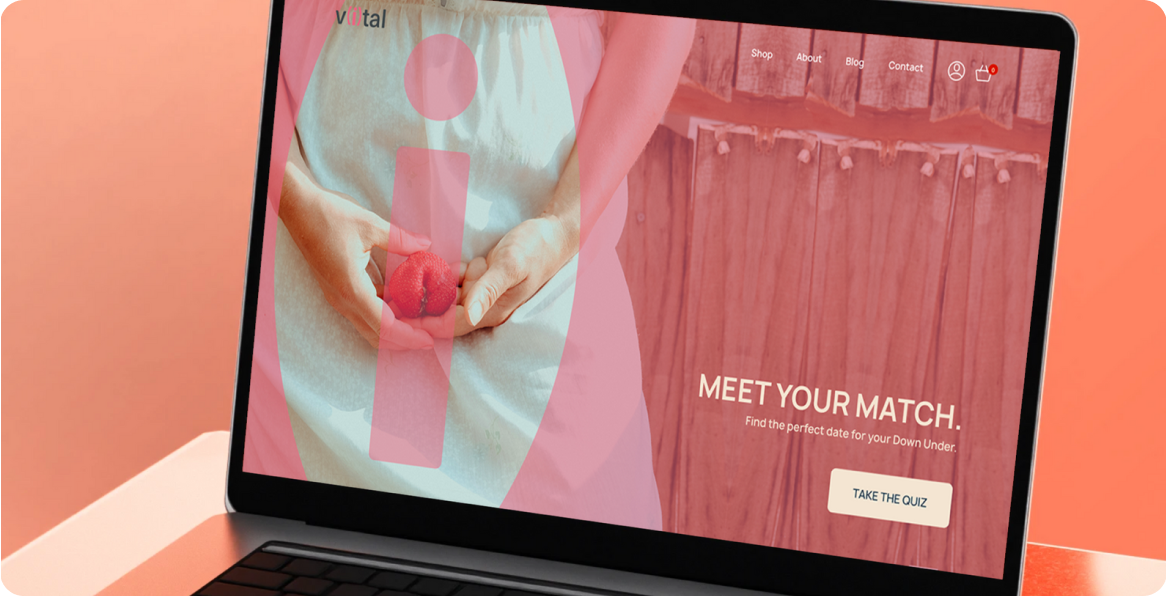
01: The Digital Experience
The website became the main entry point into V(i)tal.
Instead of overwhelming users with information, the experience is designed to take someone from uncertainty → exploration → understanding → confidence.
02: Education & Community
The blog became the educational and community side of V(i)tal. The goal was to make information feel accessible rather than clinical, creating a space where sexual wellness could be discussed alongside broader conversations about wellbeing. This helped extend V(i)tal beyond a campaign website into something with the potential to become an ongoing resource.
The website therefore had two jobs:
- Give people a reason to explore themselves.
- Give them the knowledge to have better conversations.
03: Posters
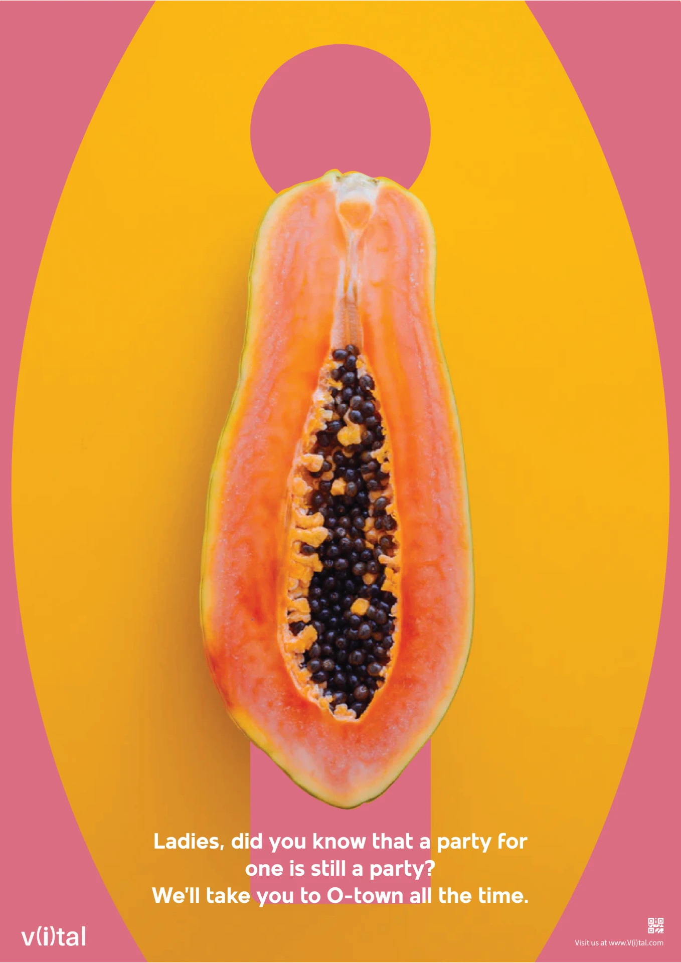
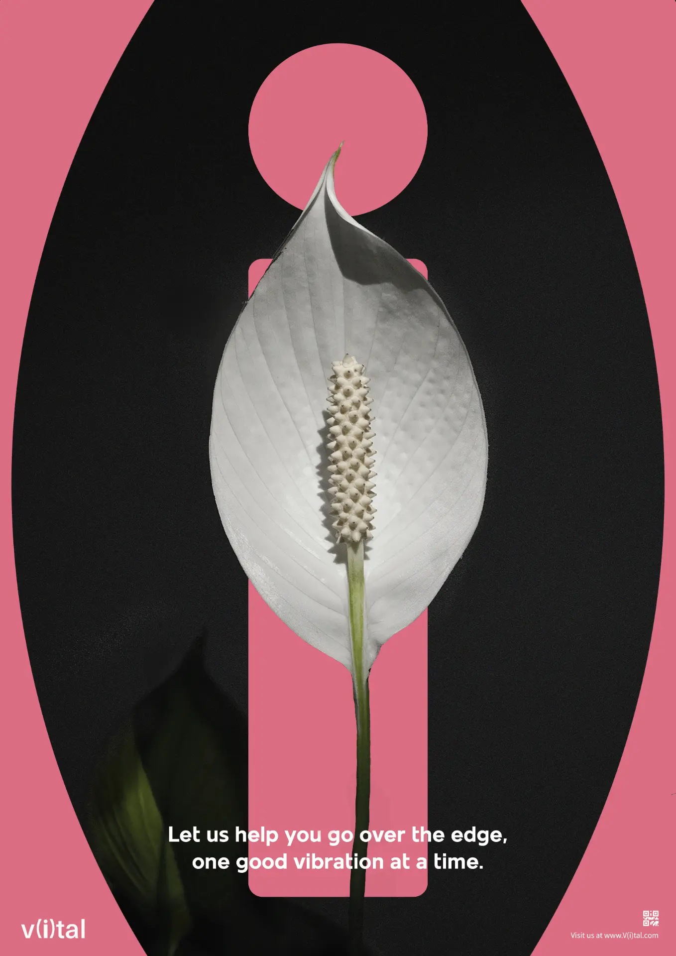
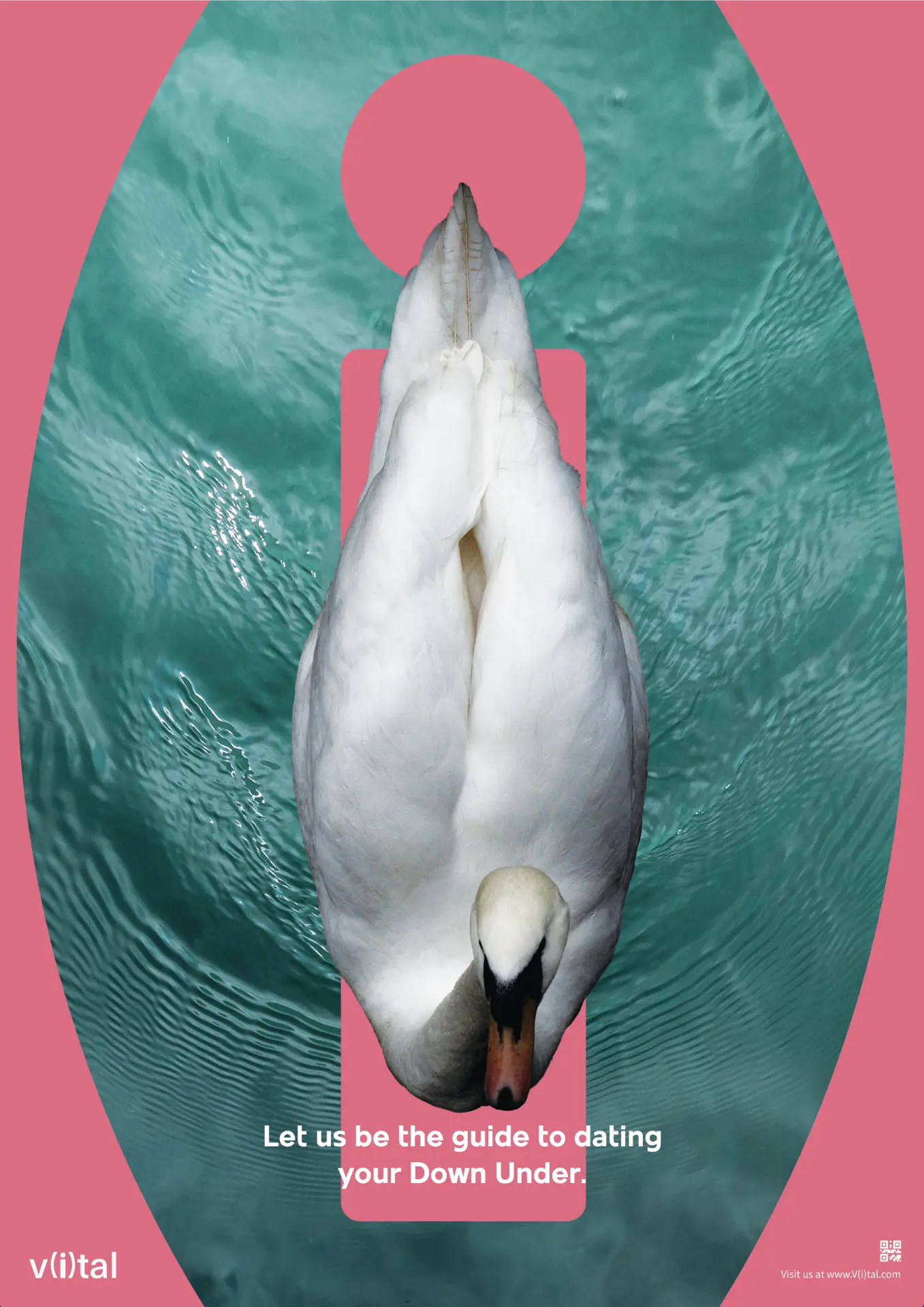
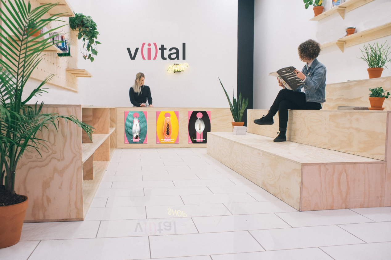
I didn’t want V(i)tal to exist only behind a screen. The campaign extended into a series of posters designed to interrupt the everyday environment with a different kind of message about female pleasure.
The visual language is intentionally modern, confident and slightly cheeky. The campaign treats female pleasure as something that deserves to occupy public space instead of whispering about it.
This was an important part of the concept: if we want to normalise the conversation, the conversation can’t stay hidden.
04: Pop-Up Experience
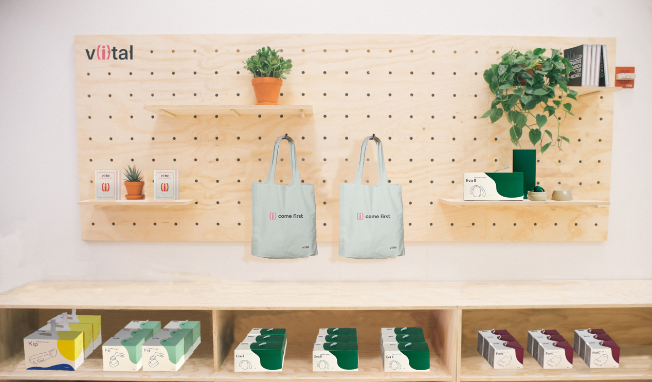
The physical pop-up shop brought the V(i)tal experience into the real world. The space was designed as a more intimate environment where people could engage with the brand beyond the website, creating an opportunity for community, discovery and real-world conversation.
The experience mirrors the digital product: Curiosity → Exploration → Education → Empowerment
This connection between the physical and digital spaces helped make V(i)tal feel like a brand ecosystem rather than a standalone website.
05: One Idea, Many Touchpoints
A key part of the project was making sure the idea could travel across different mediums without losing its personality.
- Digital: website, quiz and educational content.
- Physical: posters and pop-up experience.
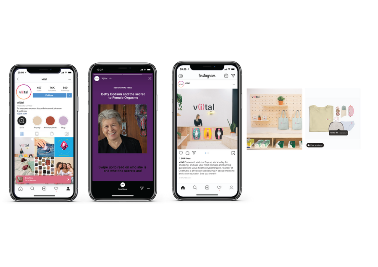
- Social: content designed to extend the conversation beyond the main platform.
Each touchpoint has a different job, but they all communicate the same underlying message: your pleasure is part of your wellbeing. Your needs matter.
The Brand
The identity needed to walk a fine line. Too clinical, and V(i)tal could feel like a healthcare service. Too provocative, and it could reinforce the very stereotypes the campaign was trying to challenge.
So I developed a visual language that feels premium, contemporary and confident, while using moments of humour and cheekiness to make the subject less intimidating. The intention was to create a brand that someone could feel comfortable discovering, sharing and talking about.
My Approach
The project taught me that designing for a sensitive subject isn’t just about choosing the right message. It’s about considering how the experience makes someone feel before they even engage with the content. Every part of V(i)tal was designed to reduce the feeling that users were entering a “taboo” space.
- The language is approachable.
- The identity is confident rather than clinical.
- The quiz creates a private starting point.
- The educational content gives users context.
- The physical experience creates an opportunity for community.
Together, these decisions make the subject feel less like something people are being asked to confront and more like a normal part of taking care of themselves.
Impact
The biggest impact of V(i)tal was the change in framing. Instead of positioning female pleasure as an isolated sexual issue, the project connected it to something much more familiar: self-care.
This gave the campaign a more positive and empowering starting point. It also allowed the idea to grow beyond a single piece of branded content into a connected experience across digital, physical and social spaces. The result was a campaign concept designed to make the conversation about the pleasure gap feel easier to enter.