Volta Management
Turning a Management Brand into a Credible Digital Experience
Overview
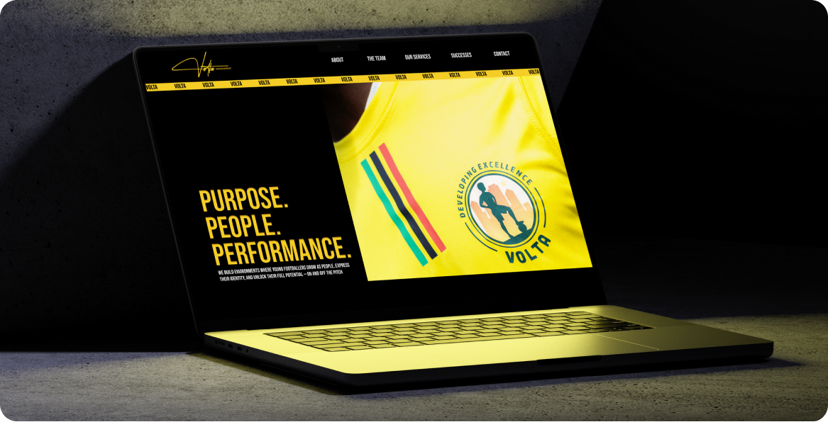
Volta Management connects grassroots football players with professional scouts and opportunities. When we started, the organisation had a strong purpose but no established digital presence, and consistent visual identity, with no clear way to communicate its credibility to potential players, families, and professional scouts.
The challenge was bigger than designing a website. We needed to create a brand and digital experience that could speak to two different audiences: young players looking for opportunity and identity, and professional scouts looking for credibility, structure, and evidence.
I led a team of four throughout the project, working across strategy, UX, visual design, and interaction. I took the lead on the final brand direction, UX, information architecture, design system, and key design decisions. The result was a visual and digital system designed to make Volta feel credible enough for scouts and exciting enough for the next generation of players.
The Brief
How might we make an emerging football organisation feel established enough to earn trust, while still feeling relevant to young talent?
Volta had an opportunity to connect grassroots players with professional pathways, but its lack of a digital presence created a credibility gap.
For a young player, the experience needed to feel:
Aspirational, energetic, personal and mobile-first
For a scout, it needed to feel:
Structured, credible, professional and legitimate
The design challenge was finding the middle ground and we couldn’t create two separate brands. We needed one system that could speak differently depending on who was looking at it.
The Approach
I led the team through a process that started with understanding the category and ended with a complete brand and digital experience.
01 — Discover
We reviewed the competitive landscape by looking at existing football academies, consultancies, and organisations.
02 — Define
We translated Volta’s 5 Star Player Model into a clearer product and content structure.
03 — Structure
I helped shape the information architecture and worked with the team to establish the key journeys and hierarchy.
04 — Design
We translated Volta’s 5 Star Player Model into a clearer product and content structure.
05 — Systemise
I finalised the visual identity and design system, creating the foundations needed for a consistent digital experience.
06 — Prototype
The team developed an interactive prototype. Guiding the interaction behaviour to ensure it supported the brand and UX.
01 — Discovery
Finding the gap
Before designing the identity or interface, we looked at how established football organisations communicate their pathways, methodology and credibility online. We analysed organisations including:
City Football Group
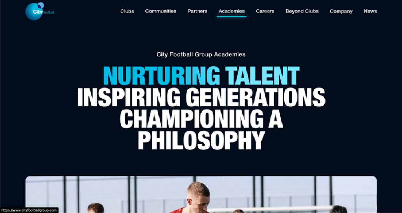
Strong institutional presence, clear pathways, facilities and structured player/academy information.
Borussia Dortmund / BVA
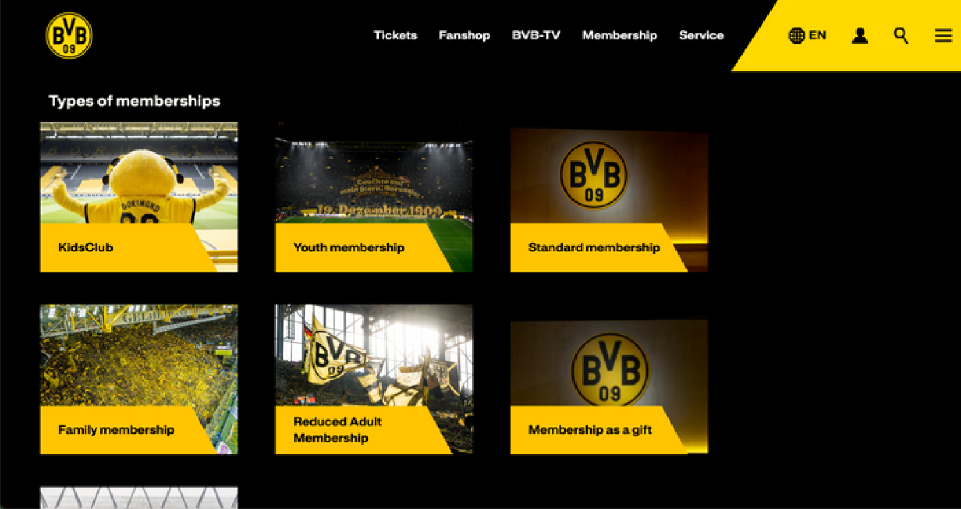
Successfully connects grassroots programmes with elite youth development and creates a clear sense of progression.
Ajax Youth Academy
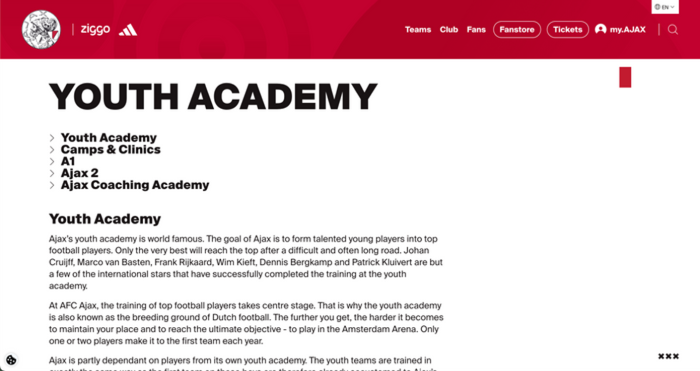
Leads with philosophy, methodology and development while establishing credibility through its approach to player development.
Competitor Landscape
| Competitor | What they did well | Opportunity for Volta |
|---|---|---|
| City Football Group | Institutional trust & clear pathways | Make Volta’s pathway equally clear without the institutional scale |
| Dortmund / BVA | Grassroots → elite progression | Make the journey feel tangible for emerging players |
| Ajax Academy | Philosophy & methodology | Turn Volta’s methodology into part of the UX |
The Gap:
Volta had the opportunity to combine all three: the credibility of a structured organisation, the aspiration of a player journey, and a clear development methodology, without feeling like another generic football consultancy.
02 — Define
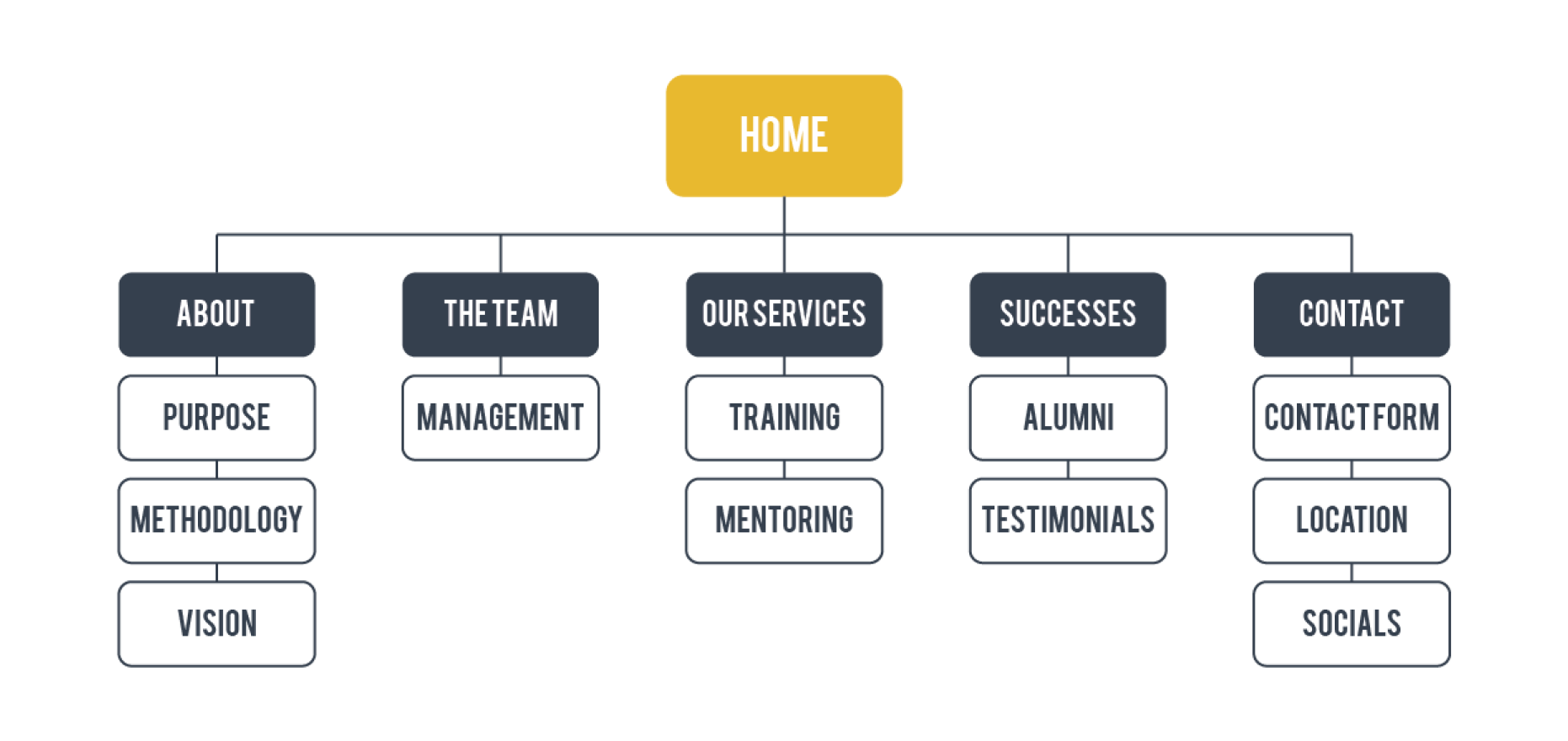
Volta already had a 5-Star Player Model that represented its approach to developing talent. Instead of treating this as a marketing copy and placing it somewhere deep in the website, I made a strategic decision that the methodology would become the information architecture.
Each pillar became a structural part of the experience. This meant that the brand’s philosophy wasn’t something users just read, it became something they could navigate.
This was one of the most important decisions in the project because it connected Brand strategy → UX strategy → Information architecture into one system.
03 — Information Architecture
This created a journey from: Purpose → People → Methodology → Proof
04 — Wireframing
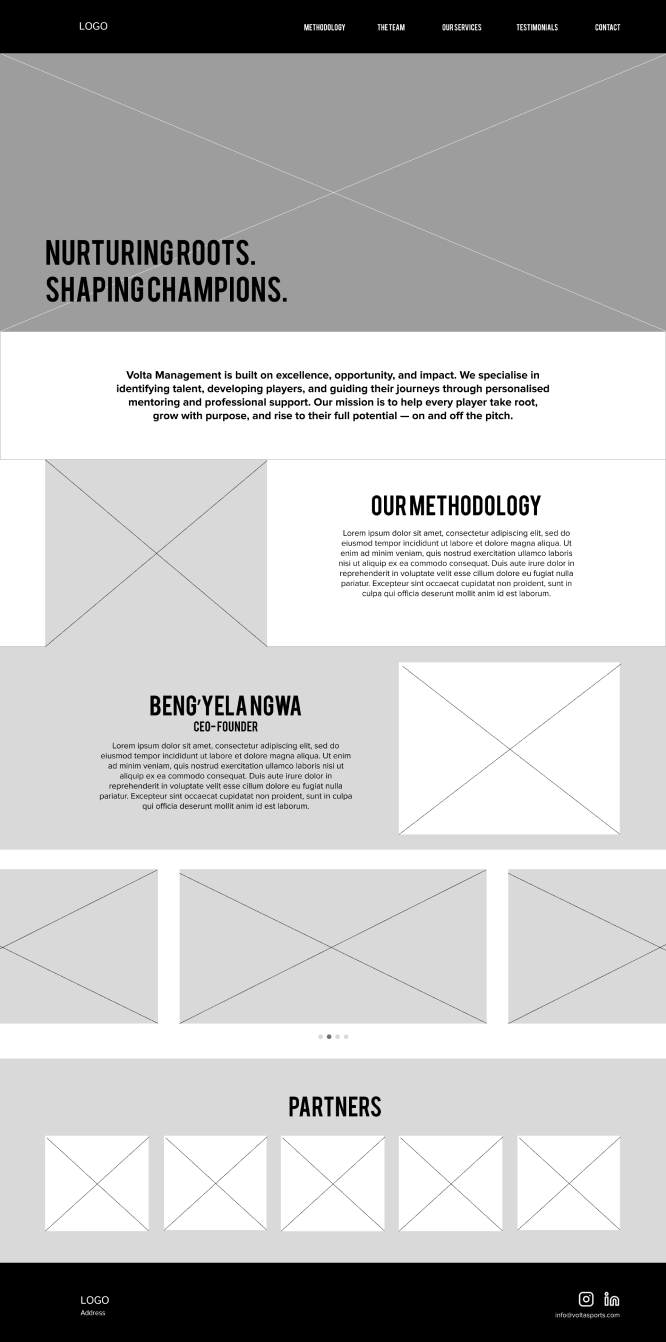
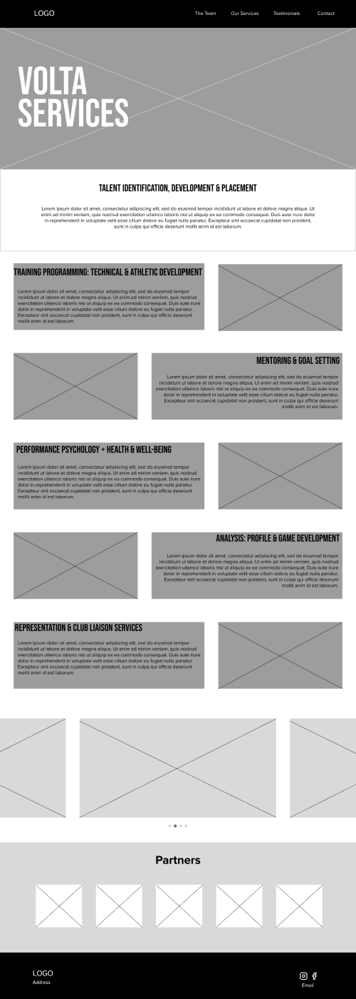
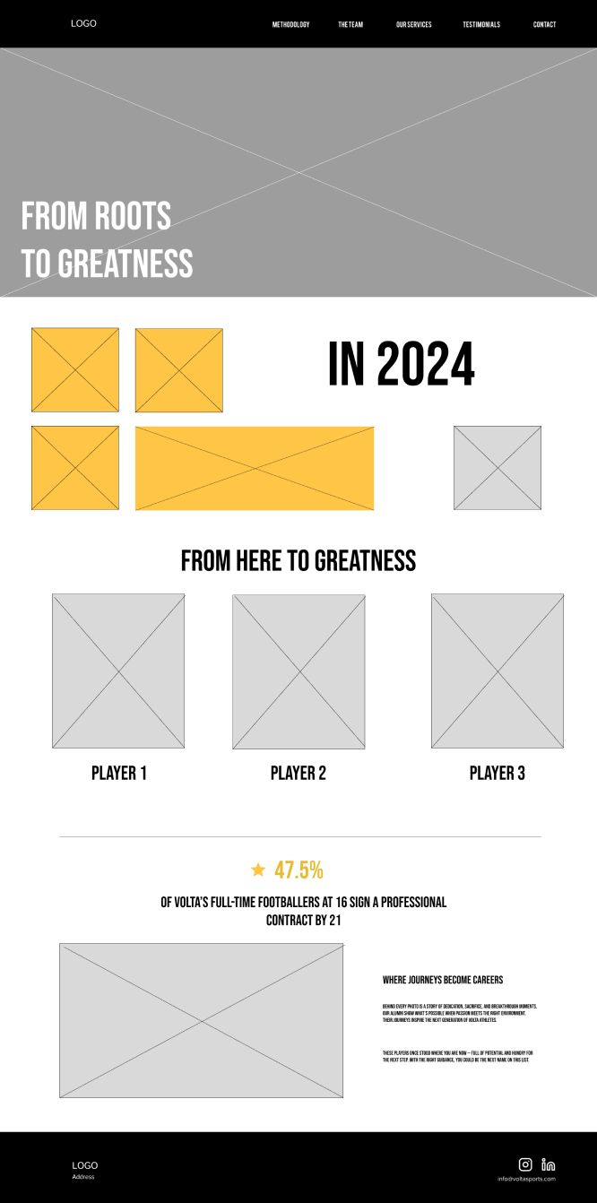
After establishing the structure, the team created low-fidelity wireframes before moving into the visuals.
We then refined the experience in Figma and conducted two informal user walkthroughs, using feedback from users and the client to iterate the hierarchy and flow.
05 — Brand & Visual Direction
Once the structure worked, I led the visual direction and finalised the brand system. The visual identity needed to occupy an interesting space, it couldn’t feel like a traditional corporate consultancy but it also couldn’t look like a football fan site.
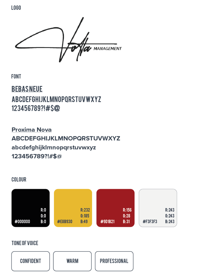
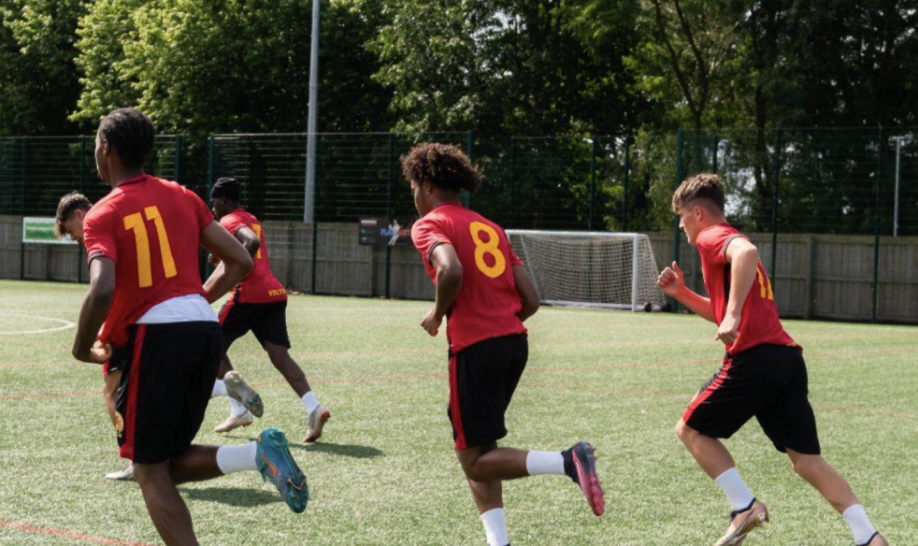
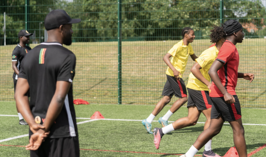
The dark-dominant interface became a key part of that positioning. This allowed the photography, statistics, player stories and motion to create moments of energy while giving the overall experience a more premium and established feel.
06 — Three Design Decisions That Shaped Volta
01 — Dark interface
The dark visual language positioned Volta as premium and established, helping distinguish it from amateur football organisations. It also created a strong foundation for photography, statistics and motion. The decision was ultimately about more than aesthetics: the interface needed to communicate confidence before the user had read a word.
02 — The 5-Star Model became navigation
This was one of the most important UX decisions. Instead of treating the 5-Star Player Model as content, I turned it into part of the website’s structure. That meant Volta’s methodology wasn’t hidden behind a paragraph of brand messaging, the product itself demonstrated how Volta thinks. This is where the branding and UX became inseparable.
03 — Motion as a trust signal
I did not personally build the prototype but the intention was to keep the motion subtle and purposeful. Motion helped communicate:
- This is an active, legitimate organisation.
- For younger players, it also introduced energy and personality.
The same interaction could therefore communicate energy to players and confidence to scouts.
07 — Final Experience
Homepage: Establishing the promise
The goal was to establish the organisation’s ambition immediately instead of making users search for what Volta actually does.
About: Building trust
The About section turns abstract brand statements into something that is tangible. “The Road Ahead” provides potential players and families a clearer understanding of where Volta is going and how the organisation intends to get there. This was particularly important for a brand without an established digital reputation.
The Team: Putting people behind the promise
We introduced the people behind Volta to humanise the organisation. For a young player or family considering a professional pathway, knowing who is responsible for that journey is an important trust signal. The team page therefore became more than a company bio, it became part of the credibility architecture.
Successes: Turning claims into evidence
The Alumni / Successes section provides social proof, instead of saying Volta develops successful players, the experience gives users evidence through player outcomes and statistics.
This was an important principle throughout the experience:
Don’t just tell users to trust the organisation. Give them reasons to.
My Role
UX & Visual Lead
I led a four-person design team and was responsible for bringing the project together from strategy through final design.
My responsibilities included:
Leadership
Set the creative and UX direction and coordinated the team’s design approach.
UX Strategy
Defined the key user needs, trust signals and overall experience strategy.
Information Architecture
Turned the 5-Star Player Model into a navigational structure and organised the experience around Purpose → People → Methodology → Proof.
Branding
Led and finalised the visual identity and ensured the brand and product experience worked as one system.
UX/UI Design
Led the interface design from wireframes through final screens.
Design System
Established and finalised typography, colour, components, layout and interaction principles.
Final Design Decisions
I was responsible for resolving the major UX and visual design choices and bringing the team’s work into a coherent final direction.
Impact
This project gave Volta something it didn’t have before and that is a credible digital identity and a structured experience for turning interest into trust. The impact wasn’t just creating a polished website, we created a system that helped Volta communicate who they are, how they develop players, who is behind the organisation, and evidence that their approach works.
The competitor research directly influenced that outcome. Instead of attempting to imitate the visual language of established football organisations, we identified the trust mechanisms behind their experiences and translated those principles into something appropriate for an emerging organisation.
The result connected: Brand → UX → Content → Methodology → Proof into one coherent experience.